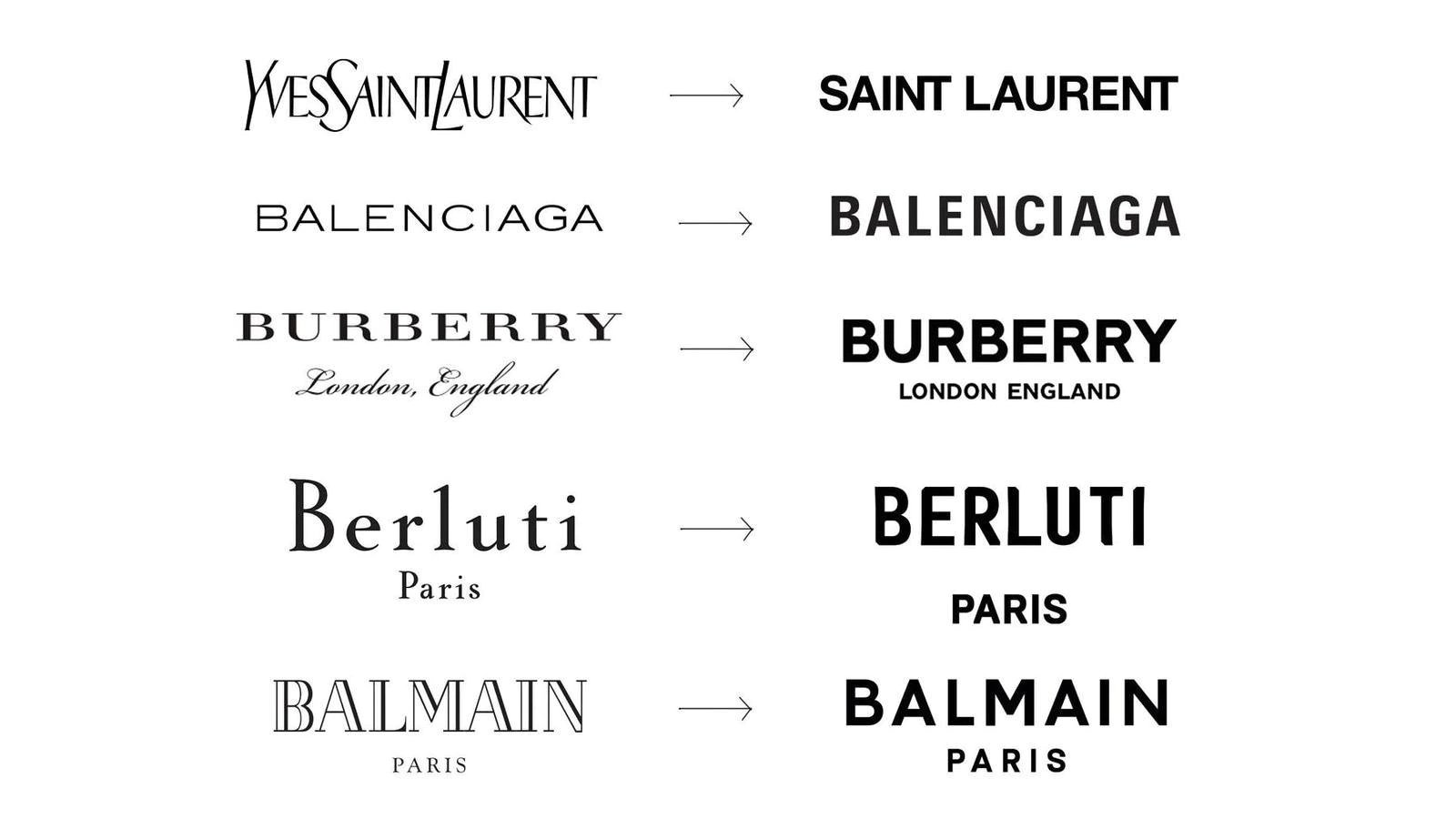
How far does a brand 'de-brand' before it starts to lose its soul?
Article by Lewis Bullock, Lead Designer, Eleven Miles
Before my uni days I thought brand meant logo. Like the literal ‘branding’ that cattle used to have, right? A few years at uni whipped me up to speed to grasp that a brand is much more. A logo isn’t a brand, a logo is a key visual component of the brand’s visual aesthetic that should concisely reflect some of the brand’s values and character. After a few years in the industry, this widened out even further to a bigger picture realisation that a brand is many many facets of a business, product or entity — because heck, even people can be brands.
This dark magic of visual assets, tone of voice, USPs, strategy and all the other industry-isms has always interested me, because every time a new branding project comes onto the workbench it’s never truly the same as the one that went before.
I have a particular hunger for seeing through the rebrands. Not the indie startups that can throw caution to the wind, throw a big middle finger up to the industry norms and land in the market big a marketing version of a tah-dah. Those are fun, but often there’s no box to think outside of, just a lovely clean slate. The really cerebral challenge for me comes from the brands that decide to draw a line in the sand and say “hey, you know that thing that we’re perceived as? Yeah we’re not really about that anymore”.
Because of the history these brands have, the public perception that’s already quietly parked in people's heads, a lot of noise always follows these projects. When a brand has a fresh lick of paint, then yeah they’re keeping fresh and spending those budgets. Kudos. But when a behemoth brand revamps its entire arsenal of touchpoints overnight that’s when there’s a buzz and a gathering around screens in our office. More than the specific critiques of logo kerning and “oh there’s another serif gone sans-serif logo” a lot of the time, the brave rebrands come packing a billion reworked visual assets, dripping with finesse and really deliver the goods, and ultimately — the reason.
A "blanding" chart | Source: Twitter
The minimalist trend that’s been in all the design blogs in the past few years, the ‘debrand’ process employed by all the big fashion houses (Saint Laurent, Burberry, Hugo Boss, Loewe and more) AND the four wheel boys (Rolls Royce, Cadillac, Toyota, BMW, Kia, Renault and more) has been seen as trend, but I believe that most of these are coming to a realisation that their visual toolkit wasn’t suited for the modern age. Some employed a simple flattening to lose the skeuomorphic baggage, others jumped on the bandwagon with a sans-serif copy and paste. But, the really interesting ones come from a place where the positioning of the brand has shifted and near to everything previous gets thrown in the bin. Think the sci-fi love letter of Bugatti and all of the delicious product-porn photography abstracts and then you’ll realise that yes they debranded, but no they didn’t lose their soul because they chased a very simple and bloody good reason for the whole thing: they changed from a sports car manufacturer to a luxury brand.
Another of my favourites, the Jodrell Bank refresh, has a similar shift albeit more of an organic process. The scientific UNESCO World Heritage Site earned its credentials in the scientific world, but never got a brand to match until tagged as “Jodrell Bank Creates Wonder” and developed an incredibly clever and refined visual tone that is both timeless and characterful. A really really hard thing to do.
But to return to the title question, I think that it can be simply answered by saying that a brand can “debrand” as much as it wants if it matches its soul — and that’s what the tricky bit is. If it’s just stripping away its former parts for a loose sense of ‘modernisation’ then it’s probably going to get pretty thin, pretty quick. Why? Because it has no substance. The brand projects that involve a soul-shift and visual shakedown, a true realignment and broadcast of a new ethos, reason to-be, and the subsequent process of figuring out what this ‘soul’ feels and looks like is the challenging bit for me. Where the fun is. Where the professional kicks are. Where the brain-bending conversations lie.
So serve me a juicy fresh rebrand any day.


