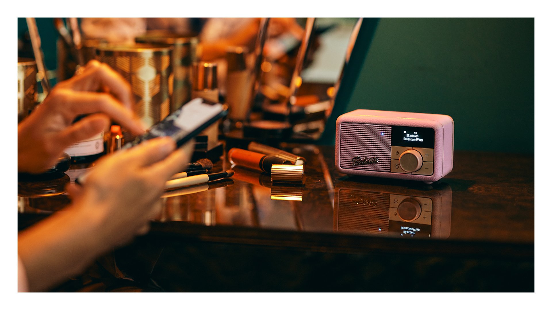
A rebrand to excite the senses
Since 1932, Roberts Radio have worked tirelessly to earn their place as much-loved household name by making audio products that are the perfect blend of proficiency and British design. But with their target audience shifting, Roberts knew a change was needed if they were to achieve their goal of building a future-proof brand, and remaining relevant as a heritage name in a sector fixated on innovation.
Our strategy team began by revising their value proposition, and set to work ensuring the brand’s inherent desire to do things differently remained its focus, and most valuable feature.
We knew that, since the day they were founded, Roberts determined never to follow the crowd – and it showed. Their most iconic devices were always designed to be displayed – they stood out and had real character, which gave them an immediate point of difference.
Because one of the most apparent things about the audio market is the increasingly generic product offering. While the choice seems overwhelming, everything looks the same – web pages and shelves full of look-alike, minimalist black boxes that were designed to blend in.
But Roberts knew not everyone wanted an invisible, untouchable product that sat in the corner. They knew listeners who wanted products with personality, that were a feast for the eyes, and that begged to be touched. That took pride of place, and produced an exceptional sound.
Our revised proposition - British Audio Designed to Excite the Senses - celebrated and communicated that Roberts produce products that look, feel and sound sensational, and that create an experience out of everyday listening.
With a strong strategic foundation in place, it was time to refresh the brand’s visual identity, starting with their name. Formerly known as Roberts Radio, we agreed to shorten simply to ‘Roberts’ — allowing the brand to move into more new audio territories, and build upon their reputation for quality products.
Alongside this abbreviation, we reverted back to a timeless signature associated with their heritage and used the beautiful golden marque featured on their beloved Revival as their logo.
Building on the new brand proposition, we also developed a photographic style that showed Roberts helped listeners tune into the moment, a colour palette that showed they’re proud to stand out, and chose a font that celebrated their connection to iconic British design.
Finally we arrived at a style that captured those personal moments to music that listeners might share, paired with a bold, confident yet utterly personable persona.
As the brand begins to activate their re-tuned identity, most notably with their new look website and latest product launch, we will continue to work together to proudly introduce their new branding to customers old and new, and are confident they will seal their position at the heart of British homes for decades to come.


